Amur
Multi-channel digital strategy
Role —————————
Strategy
User research
Branding
Product design
The Challenge
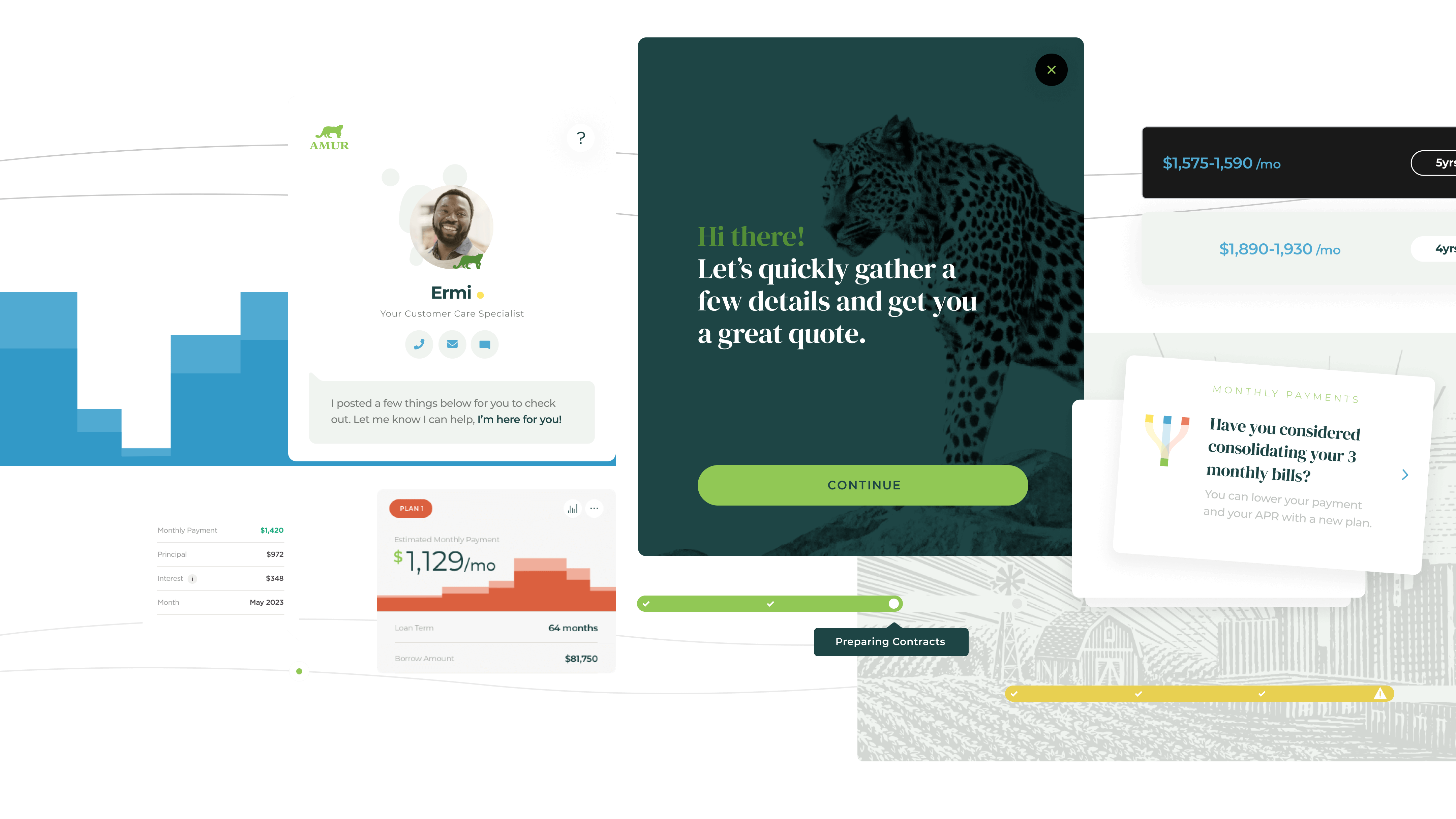
Amur provides financing programs and guidance for small businesses, with a focus on equipment needs for a myriad of verticals.
We partnered with Amur to define a multichannel digital strategy, concentrating on opportunities to foster engagement with existing and prospective customers.
The Process
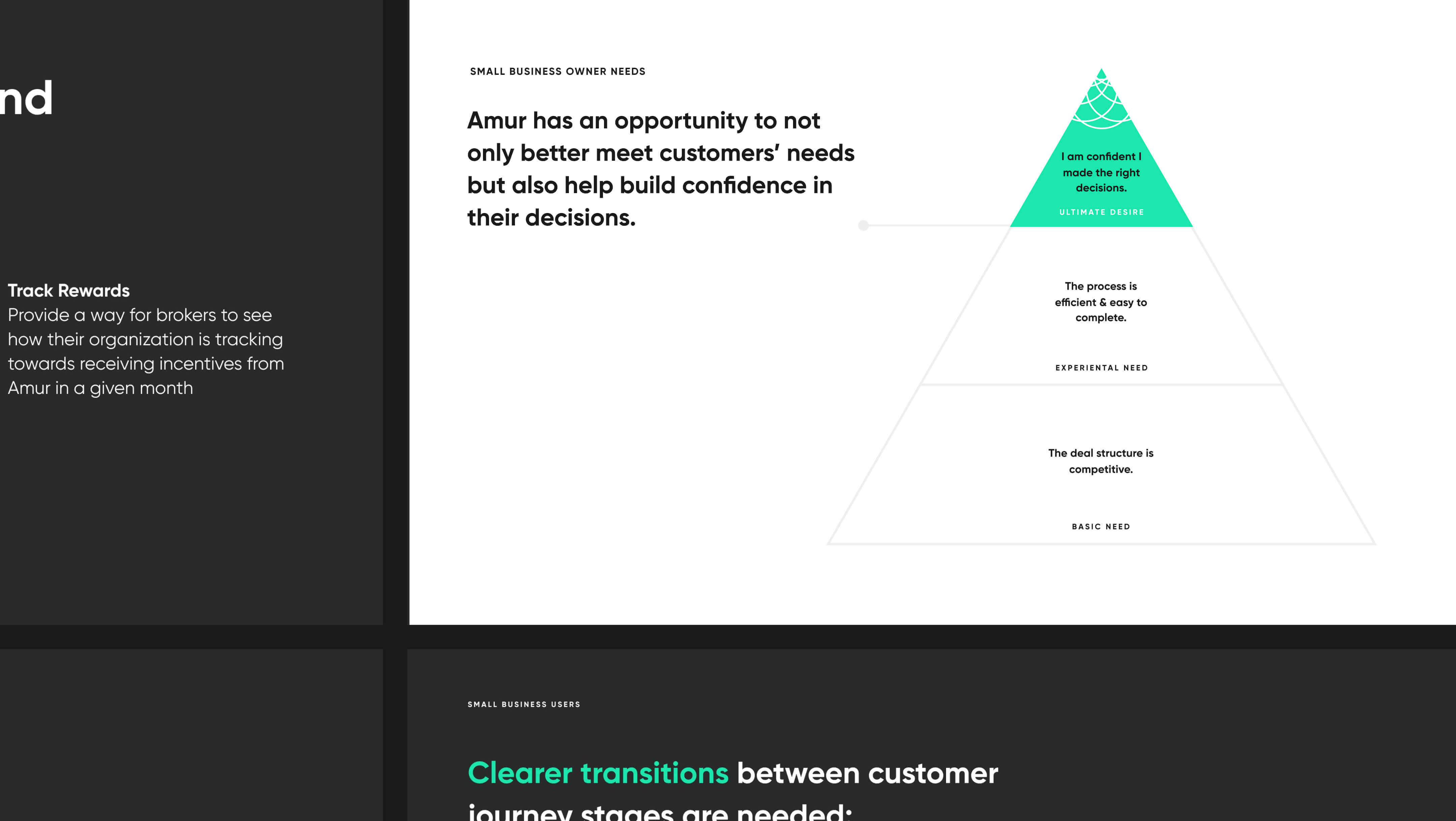
We began with research to better understand Amur’s key user types. In one-on-one in-depth interviews, we dug into user needs, pain points, and experiences working with Amur to identify cross-channel opportunities for Amur to better meet users’ needs and resonate with prospective end users.
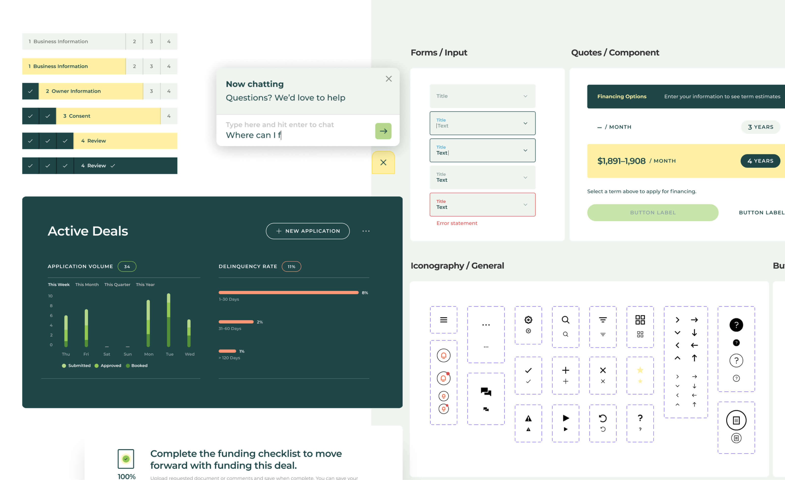
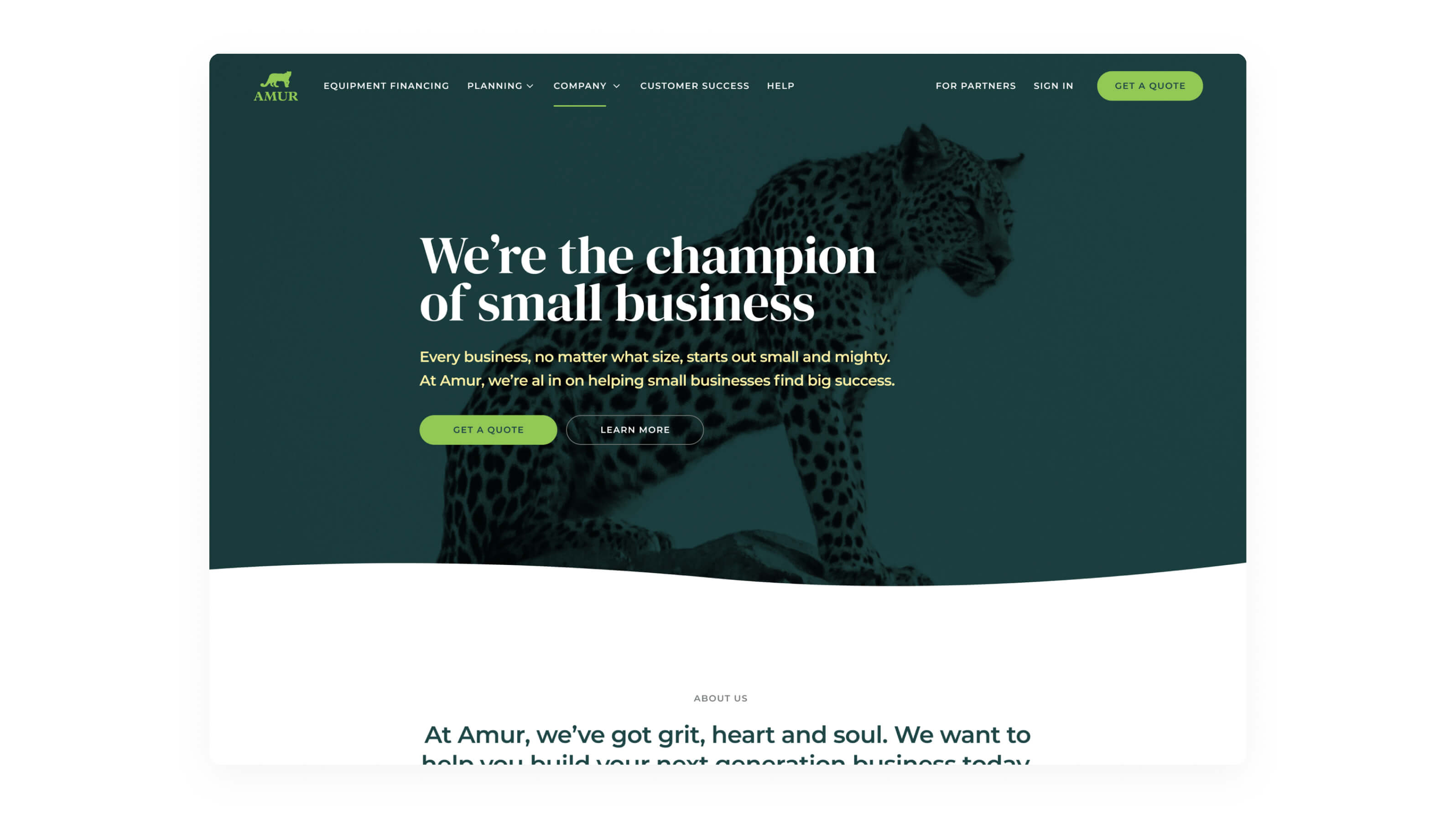
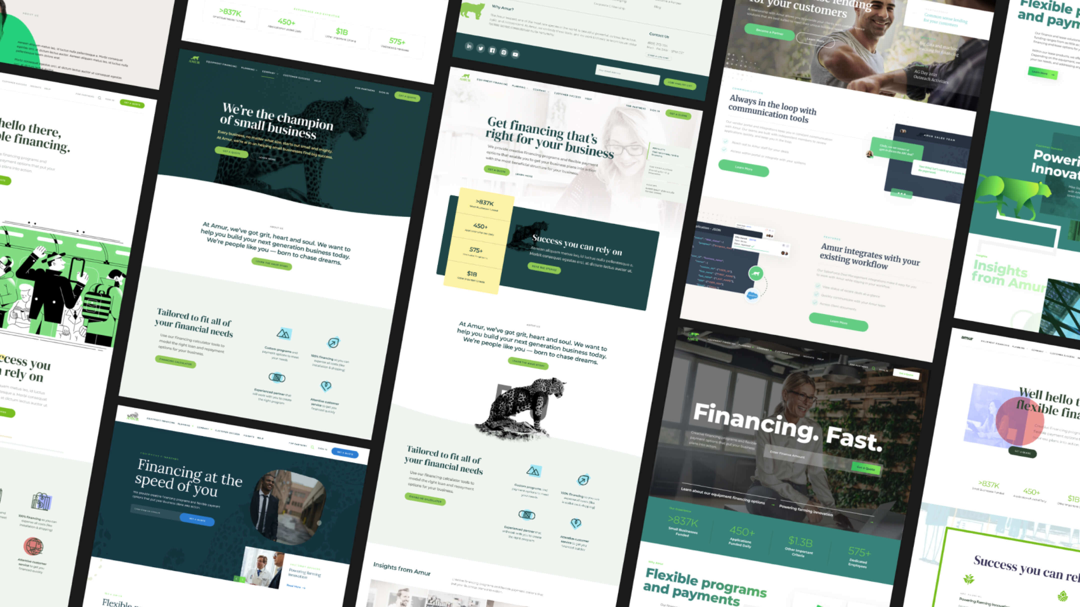
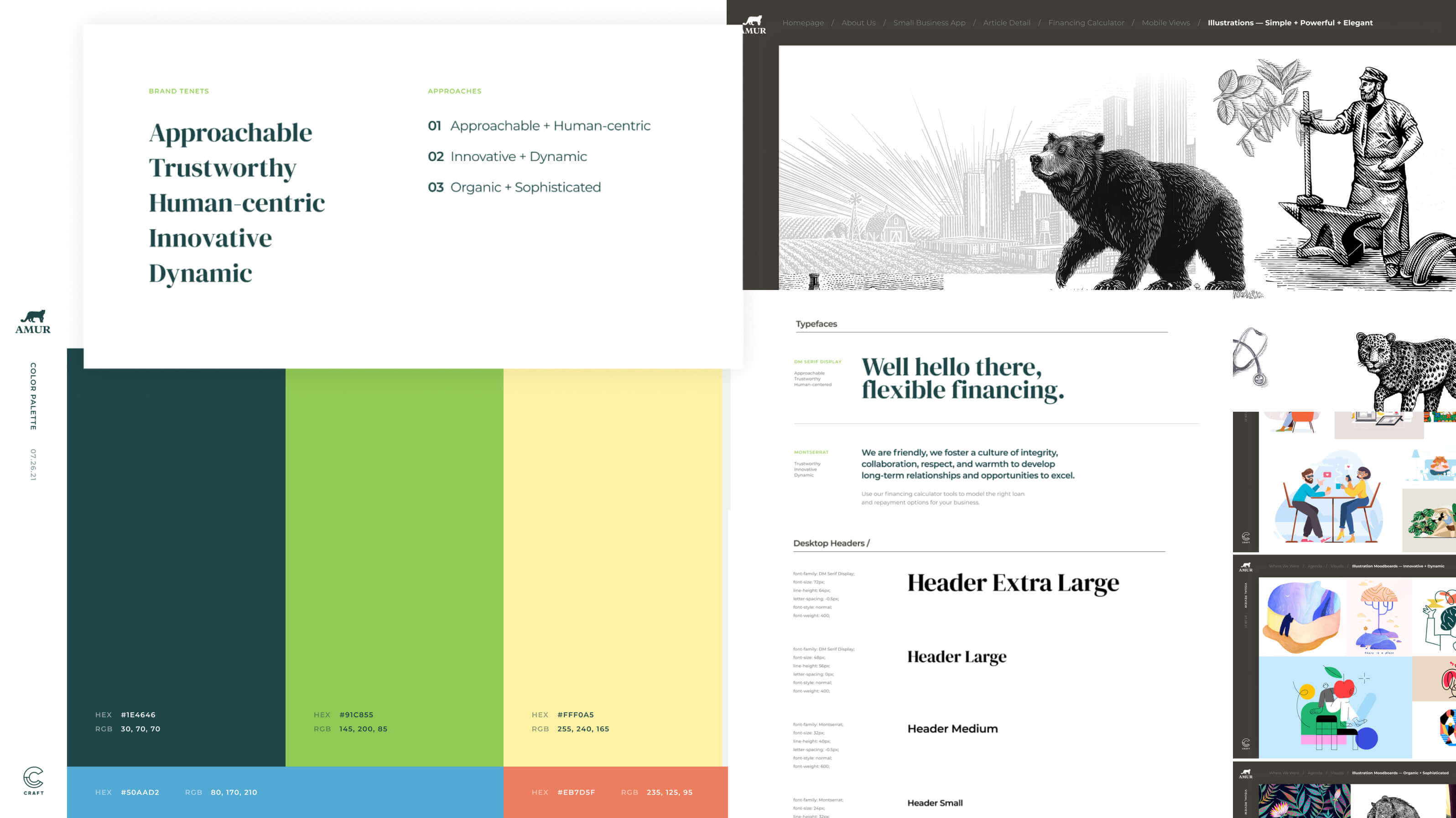
Inherent in the process of evolving Amur’s digital presence was an evolution of their brand. To establish this new visual language, we created branding concepts, and applied those directions to prospective marketing homepage concepts to help Amur see how the brand could manifest in design.
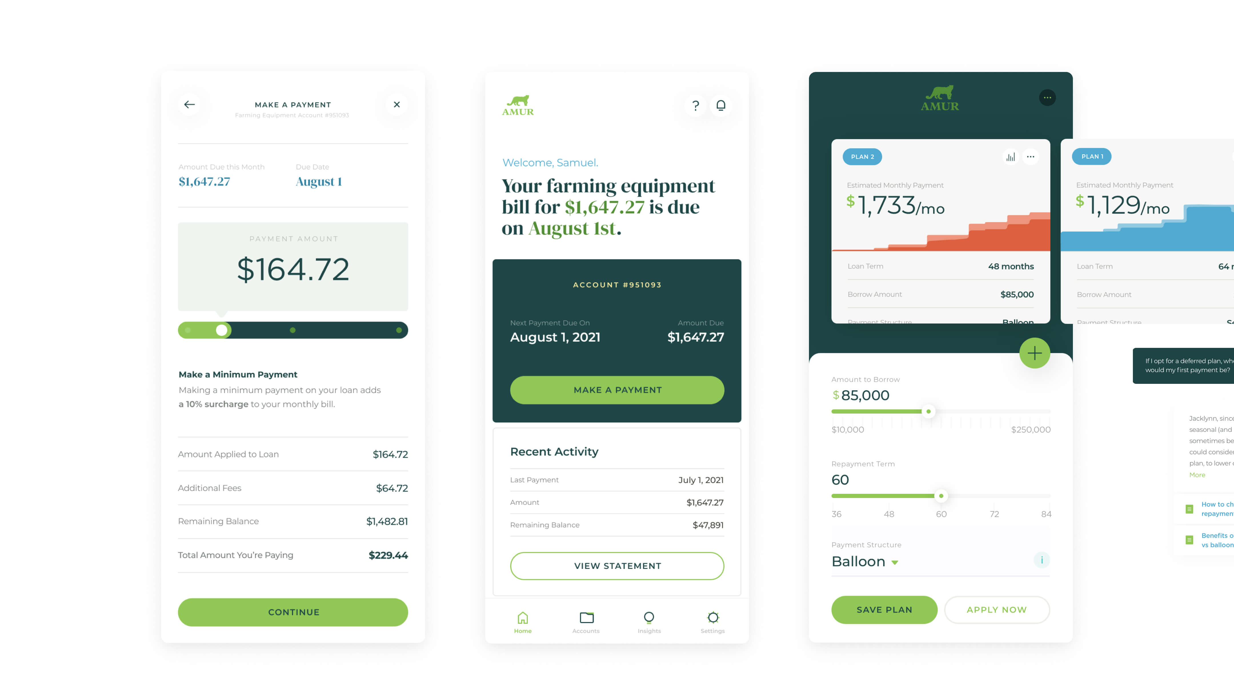
Trustworthy and Human-Centric
Two tenets central to Amur’s brand are trust and connection. For Amur to be successful, they felt it imperative to build real relationships between their advisors and small business customers. Accordingly, it was important for their digital experiences to support these offline exchanges.
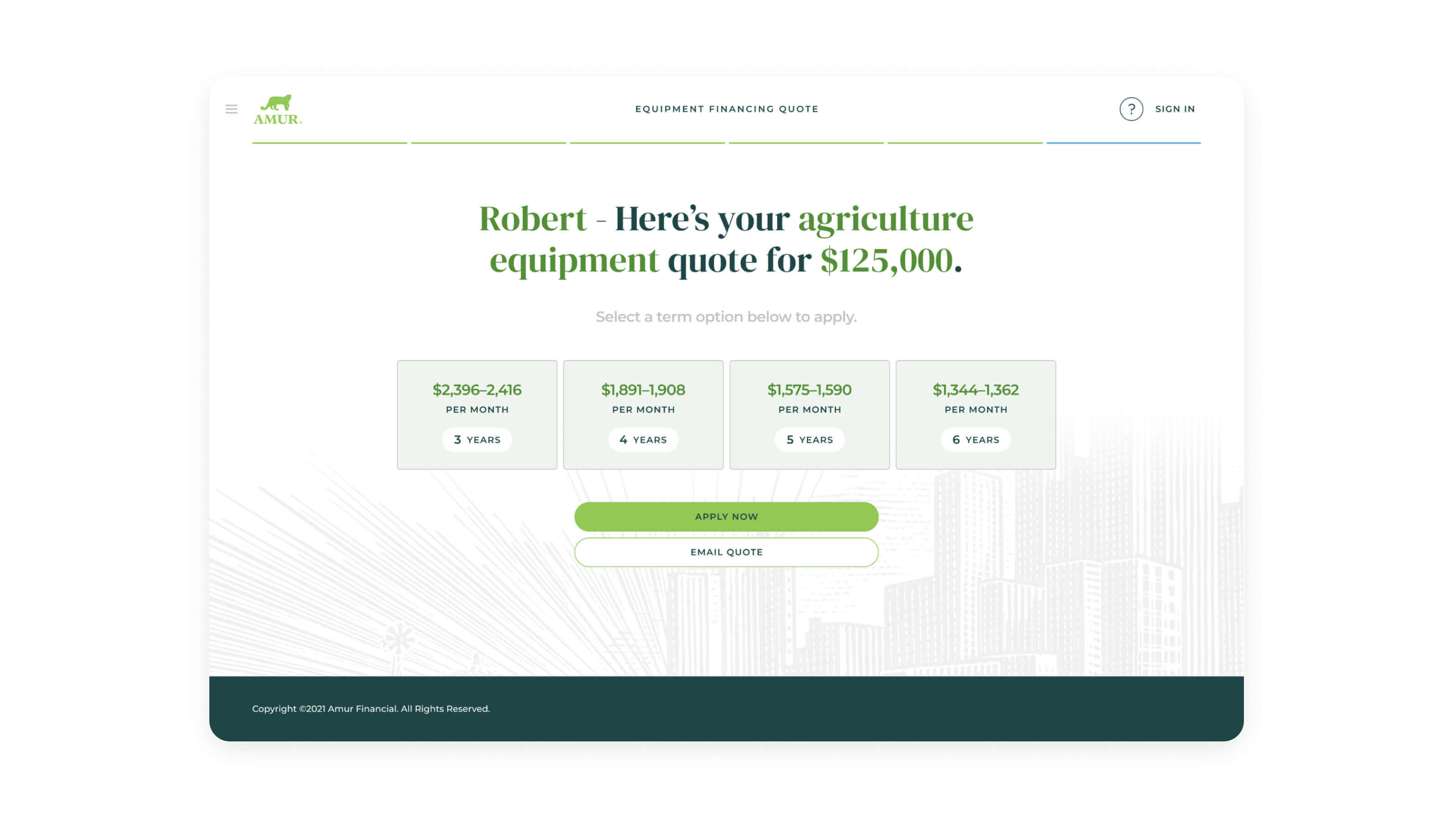
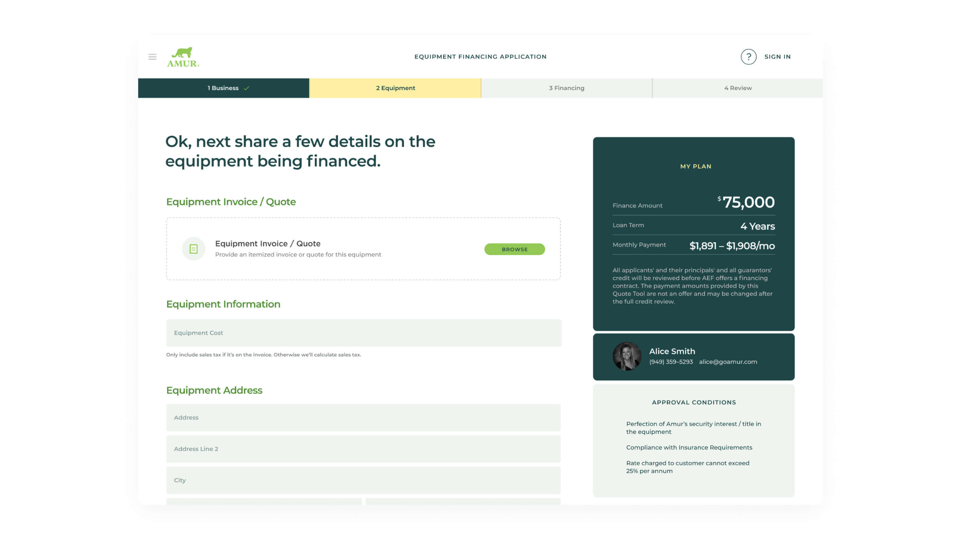
To build trust, the digital experiences provide tools and information that demystify the loan application process and make it easier for potential customers to know where they are in the loan application process.
To emphasize the human-centric nature of their business, Amur team members are connected to customers through every aspect of the customer journey; from exploring options, application and onboarding, payment and management of a loan, to end of a contract and renewal.
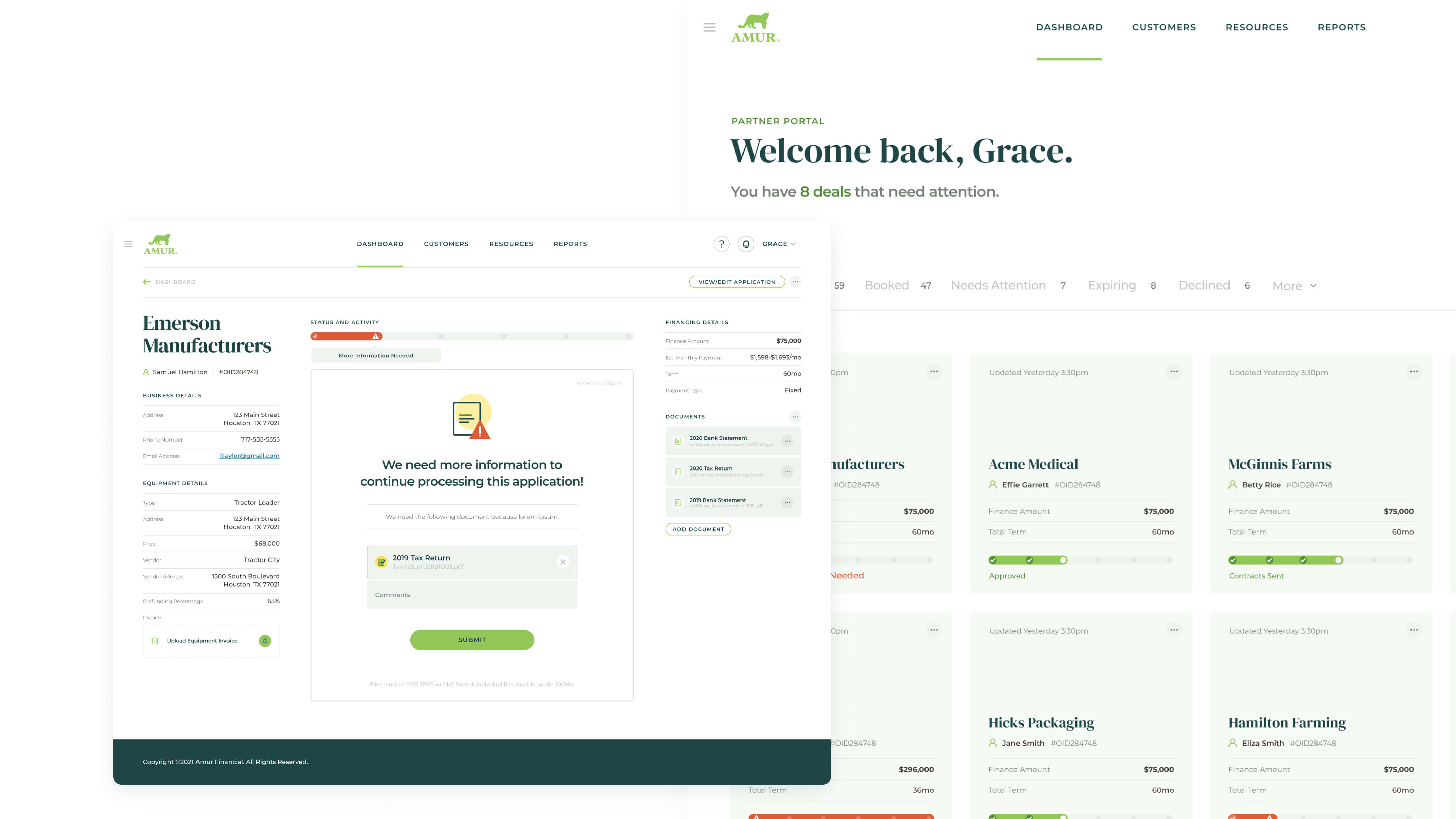
An Integrated Workflow for All
Through the creation of advisor tools that integrate with the workflow of small business customers, Amur is able to streamline workflows and automate manual processes for all users.
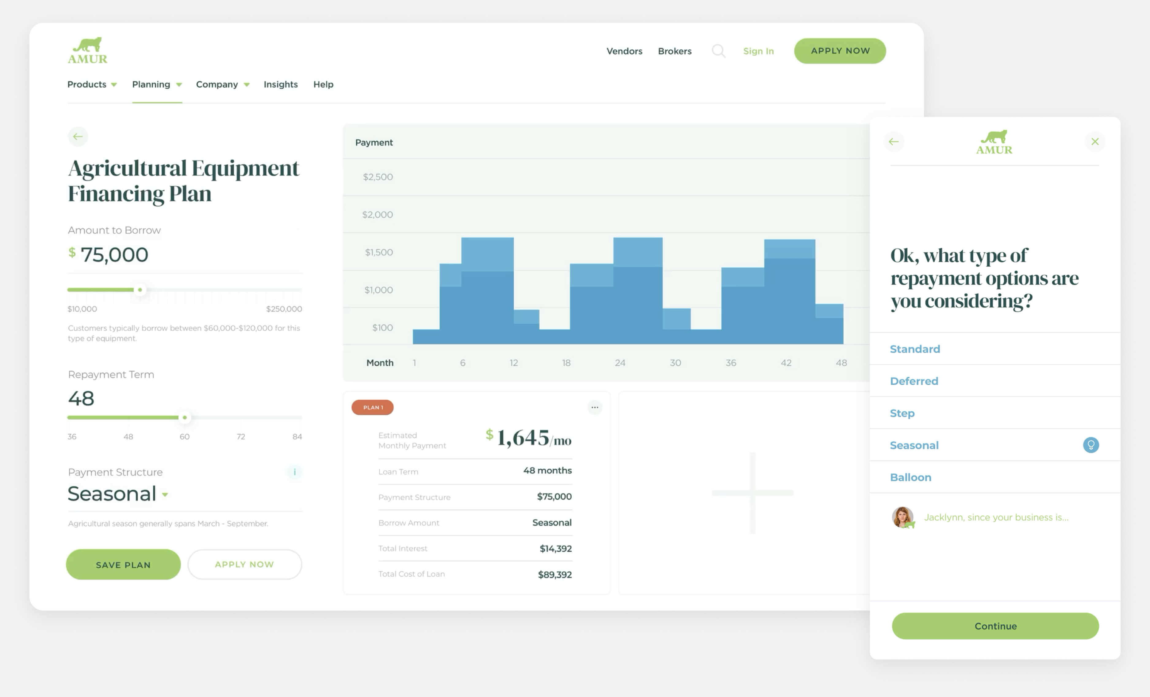
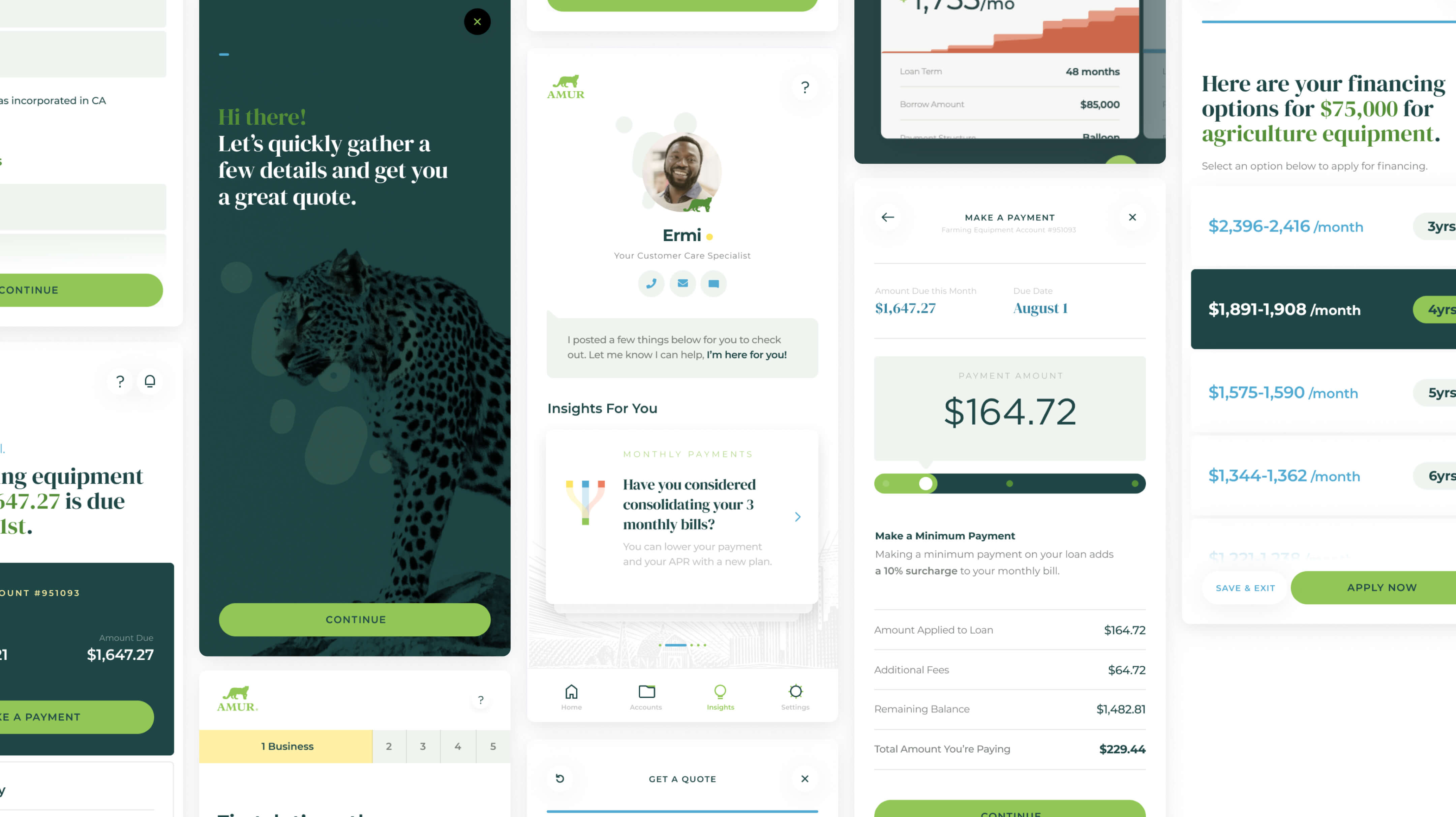
Our digital strategy prioritized engaging with customers across channels, and connecting them with Amur team members every step of the way. All of that hinged on a modern, efficient, transparent UX.
Kieran Evans, Craft
